AI Supply Exchange / Brand resources
Built to be
recognized.
A clear mark. A confident blue. Everything you need to bring AI Supply Exchange into your next page, presentation or project.
Download the brand kit ASE mark / Cobalt blue / 01
The core of our identity
Two sides.
A shared direction.
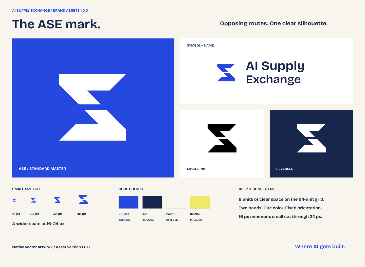
Our mark brings two opposing bands together into one S. Its open center suggests exchange; its solid geometry reflects the physical infrastructure behind AI.
Download the vector mark ↓01 / LOGOOne consistent signature.
Use the supplied artwork in one color. Pair the mark with the full name when introducing the brand.




Give it room.
Leave at least 8 units of space around the artwork on its 64-unit master grid. Keep nearby type and images outside that space.
Keep the shape.
Use both bands together, in one color and in their supplied orientation. Keep the artwork flat and the proportions intact.
Make small sizes clear.
Use the small cut at 16–24 px. Use the standard mark above 24 px, or a supplied app icon for padded placements.


02 / COLOR & TYPEBlue leads the way.
Cobalt is our primary brand color. Deep ink, warm paper and a bright yellow accent give it balance.
#2549DF#17264B#F7F5EE#F0E76BWhere AI gets built.
Find the sites, suppliers and expertise behind your next project.
03 / IN THE WORLDReady to share.
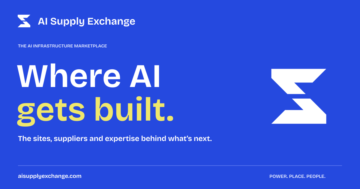
A familiar first impression.
The 1200 × 630 social card pairs the mark with our promise. Use the PNG for sharing, or the outlined SVG when you need a scalable layout.
Download the social card ↓Your next project starts here.
Symbols, wordmarks, transparent PNGs, app icons, social artwork, fonts, colors and a visual reference sheet in one versioned kit.
Assets v1.0.0 · Usage guide · Reference sheet · File checksums